Going responsive: Redesigning the Library Homepage and Discovery Tool at PolyU
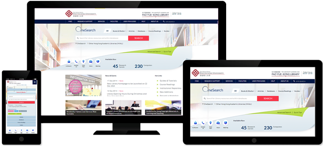
The Library has recently launched a fully responsive redesigned homepage that is optimized for browsing on mobile devices of different sizes. Being the first among UGC-funded university libraries in Hong Kong to adopt responsive web design when developing its homepage, the Library aims to improve usability and user experience by providing users with an app-like experience that brings relevant information and the entire Library Catalogue right to their fingertips no matter what kind of electronic device they are browsing on.
A homepage designed with responsive web design simply means that the structure, content, images, and videos of the homepage adjusts to the screen size of the viewing device so that the layout remains the same for any device, be it a smartphone, tablet, or desktop computer. “We live in a world where mobile devices are increasingly becoming the chief means to browse the Internet. As the learning hub of the university, it is essential that information on the Library’s homepage is presented in a way that patrons can easily interact with, regardless of what device they are using,” said Mr. William Ho, Section Head (User Experience and Outreach).
The homepage redesigning project began in Jan 2014 with a consultation to solicit comments from target users, including student bodies and faculty members. Their suggestions were further discussed and consolidated by a Library task force designated to revamp the homepage, discovery tool and catalogue. In early summer of 2014, the task force worked closely with a web designer on the layout, graphics, font, and navigation of the homepage. After the homepage was finalized, Mr. Wayne Lam, Systems Librarian, and his team integrated the homepage with a content management system, so that contents can be easily updated, changed, and managed by Library staff.
The result of this transformation is a vastly improved user experience. For example, users no longer have to do the cumbersome and time-consuming act of zooming and shrinking text and images on screen making it easier for users to navigate the homepage. The discovery tool navigation has also been redesigned to be more mobile friendly and intuitive. "A bento-box style display was also implemented which groups dynamic search results by major resource types," William said, “We hope by redesigning the homepage and discovery tool, we can help patrons in finding information in the appropriate Library collection for their research more efficiently.”
Another notable feature is the real-time display of facilities status. "At the landing page, patrons can now view how many computers and research carrels are readily available for use in the Library. By clicking the number indicating the availability, patrons can reserve the facility right away," added William.
The Library homepage can be viewed by visiting http://www.lib.polyu.edu.hk

 PolyU Library AI Chatbot